Separations
Spot Color Separations
Unleash the pure, unadulterated power of color with spot color separations. It's the screen printer's alchemy, transforming digital vectors into a symphony of solid, unwavering hues. Forget subtle gradients; this is about celebrating the bold, the defined, the iconic. Each color is a distinct note, a carefully chosen Pantone tone, orchestrated by Illustrator to ensure the final print resonates with the visual harmony of the approved proof.

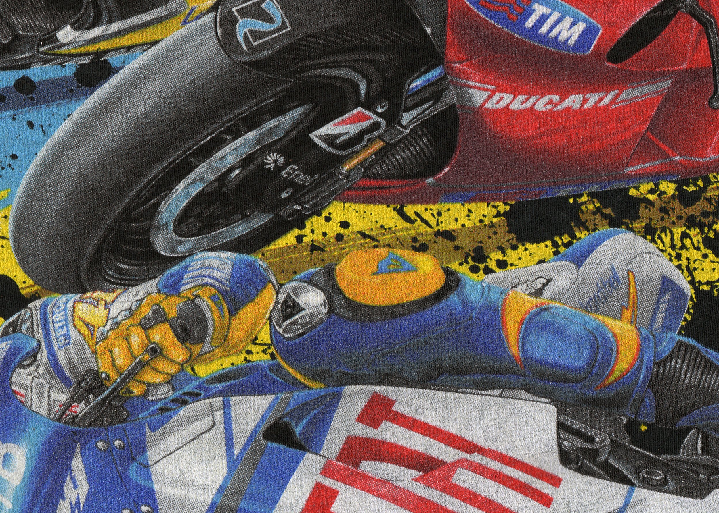
Simulated Separations
Precision layering, pixel by pixel, that's the heart of simulated color separations. In Photoshop, we dissect high-resolution images into halftoned layers, each carrying a specific ink. It's a calculated dance of overlapping pigments, where red and yellow merge into orange, and nuanced halftones create the illusion of photographic depth and detail on fabric.
Process Separations
Harnessing the power of raster data, process separations in screen printing meticulously constructs color from the fundamental CMYK palette. Each color, rendered as a precisely angled halftone, builds upon the last, weaving a tapestry of hues. This technique, a cost-effective approach to full-color reproduction, demands high-resolution artwork and a pure white substrate to achieve its vibrant potential.

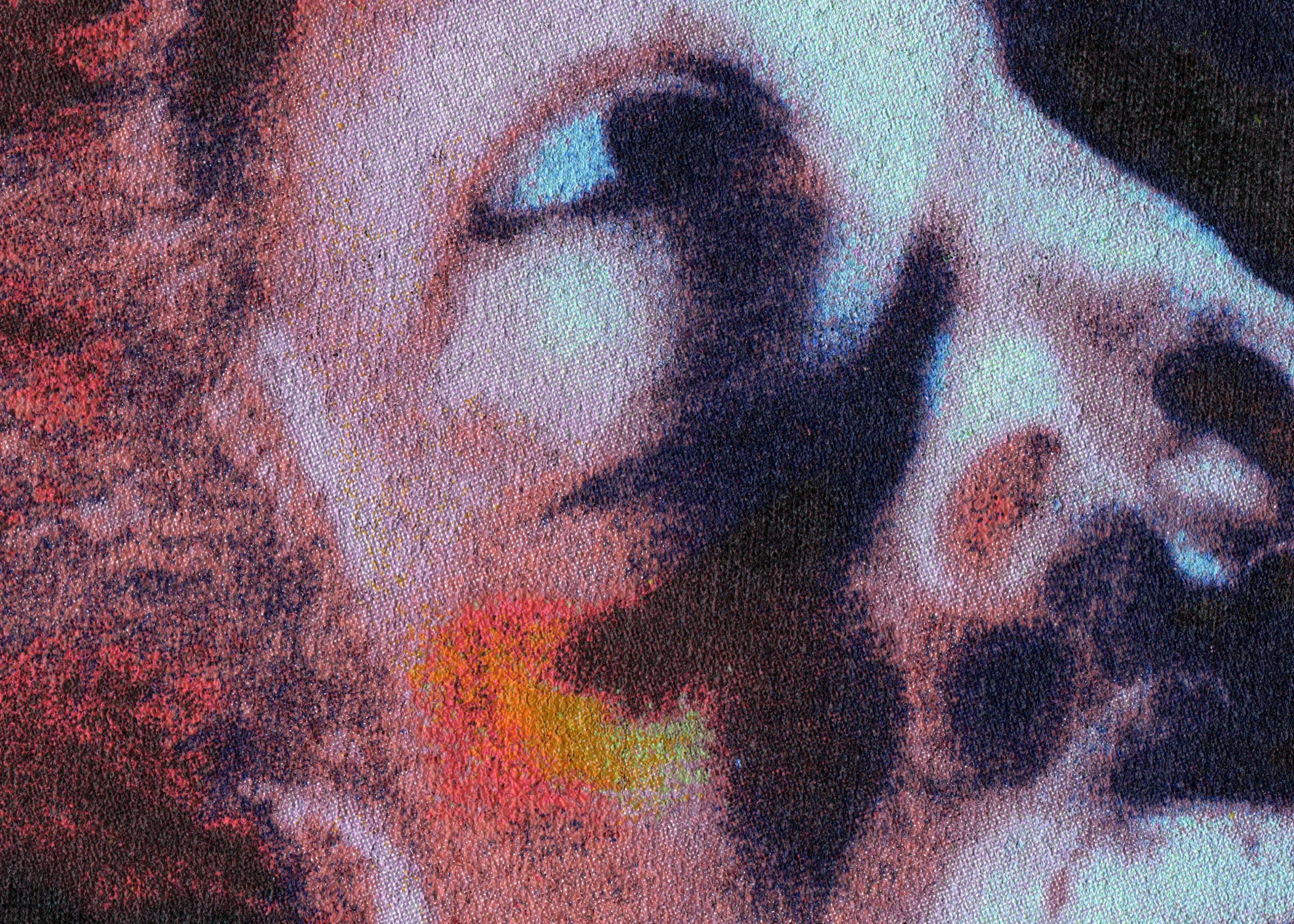
Index Separations
Index Color Separations: Where pixelated dreams become tangible realities. This screen printing technique, ideal for capturing the soul of paintings and drawings, defies halftone constraints by employing a randomized dot strategy. It's a visual sleight of hand, upscaling low-res raster art into stunningly detailed prints, where abutting colors create the illusion of seamless depth.